Building layouts with accessibility in mind - Part 1
Go from confusion to confidence with a step-by-step Swift Concurrency course, helping you smoothly migrate to Swift 6 and fully leverage its features.
One of the most important things to keep in mind when building an app’s UI is to make sure that it looks good in all devices and resizes accordingly for you users’ needs.
This means that, for example, if a user changes their content size category, then your app should adapt its layout to allow them to access all content and perform any actions necessary.
In this article, which is the first of two parts, where we’ll build a fully accessible and resizing layout, we’ll explore the power of UIStackViews and how to write enough constraints to allow your layouts to resize properly.
What we’ll be building
Our UI is simple and it is an adaptation of a real-world feature that I have recently had to implement at work. The layout consists of a title, a subtitle and a button, which we can think of a CTA.
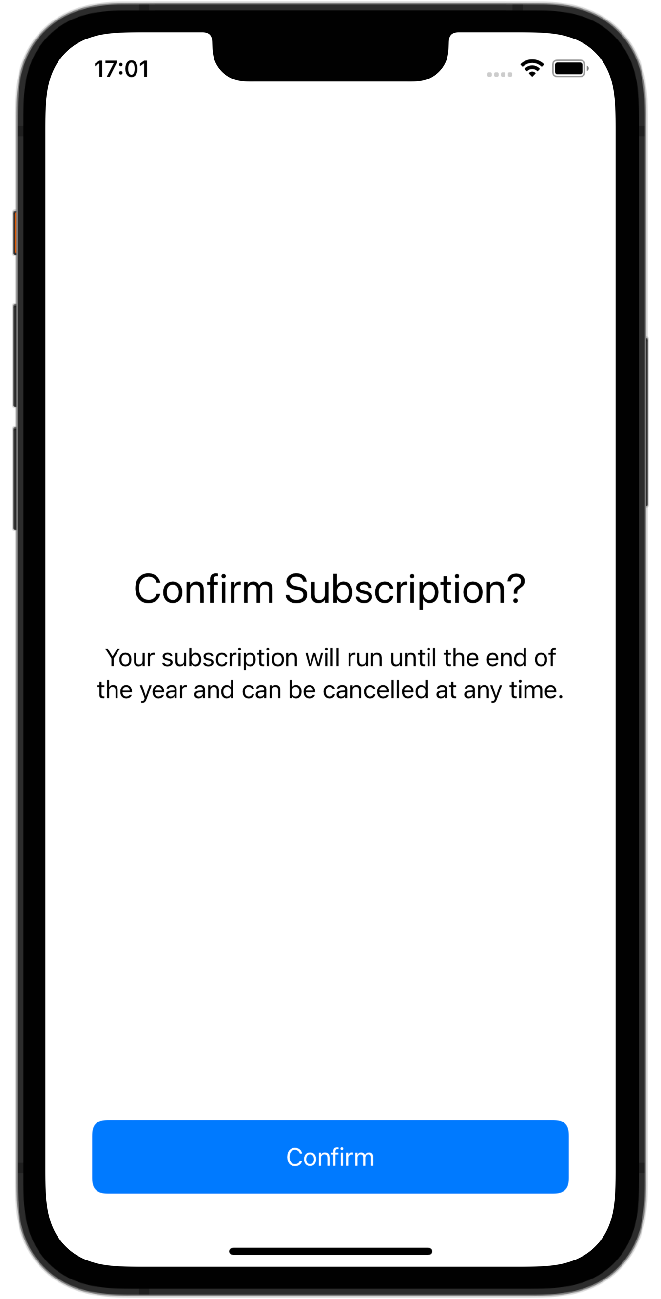
As it can be seen in the screenshot below, the button needs to be pinned to the bottom of the screen and the rest of the content should be centered in the rest of the screen, taking up as much space as possible:
In this first part, we’ll look at the basic layout of the copy content view and making it resize accordingly and, in the second part, we’ll look at leveraging the power of UIScrollViews to make content accessible when content size category changes.
Content View
The first thing we’ll build is the title and message part of the UI. We will encapsulate these UI elements into a custom UIView called CopyContentView and store the state of the UI in a view model, which the view will be initialised with:
class CopyContentView: UIView {
    let viewModel: CopyContentViewViewModel

    init(with viewModel: CopyContentViewViewModel) {
        self.viewModel = viewModel
    }
}
Now that we have laid the foundations for our text section, we can move on to declaring the UI components themselves.
Title and Message Labels
The next items on our list are both the title and subtitle label that comprise the screen’s text section. Since the initialisation code for both of them is going to be similar, a small static private function that encapsulates common initialiser code is in order. This function will only take in the text style for each label as a parameter:
class CopyContentView: UIView {
		// ...
		let titleLabel = ContentView.createLabel(textStyle: .title1)
    let bodyLabel = ContentView.createLabel(textStyle: .body)

    private static func createLabel(textStyle: UIFont.TextStyle) -> UILabel {
        let label = UILabel()
        label.numberOfLines = .zero
        label.adjustsFontForContentSizeCategory = true
        label.textAlignment = .center
        label.font = .preferredFont(forTextStyle: textStyle)
        return label
    }
}
Closely inspecting the code above, we see the first signs of keeping accessibility in mind when creating each of the components. Since they will be wrapped in a UIStackView, we want our labels to take up as much space and lines as they need, which we can achieve by setting the numberOfLines property to 0.
The adjustFontsForContentSizeCategory property tells the label to automatically react to changes in the device’s content size setting and, similarily, setting the font to .preferredFont(forTextStyle:) picks an appropriate font size for a given text style based on the user’s content size category.
UIStackView
It is time to lay out the components in its container view now. To help us with resizing and distributing the labels, we create a vertical, fill-distributed and center-aligned UIStackView:
class CopyContentView: UIView {
    let stackView: UIStackView = {
        let stackView = UIStackView()
        stackView.alignment = .center
        stackView.distribution = .fill
        stackView.axis = .vertical
        stackView.translatesAutoresizingMaskIntoConstraints = false
        return stackView
    }()
}
We can then add a new private method to add the labels we created earlier to the UIStackView, which in turn will be laid out in our CopyContentView using NSLayoutConstraints, allowing for it to be centered in the view and resize when needed, without ever overflowing:
private func layout() {
		// 1
    [titleLabel, bodyLabel].forEach(stackView.addArrangedSubview(_:))

    // 2
    addSubview(stackView)

    NSLayoutConstraint.activate([
		    // 3
        stackView.leadingAnchor.constraint(equalTo: leadingAnchor),
        stackView.trailingAnchor.constraint(equalTo: trailingAnchor),
        // 4
        stackView.centerXAnchor.constraint(equalTo: centerXAnchor),
        stackView.centerYAnchor.constraint(equalTo: centerYAnchor),
        // 5
        stackView.topAnchor.constraint(greaterThanOrEqualTo: topAnchor),
        stackView.bottomAnchor.constraint(greaterThanOrEqualTo: topAnchor),
    ])
}
Let’s closely inspect what we’re doing in the layout method above:
- First, we add the labels as arranged subviews, leaving the layout responsibilities to the
UIStackView. - We add the
UIStackViewto theCopyContentViewusing theaddSubviewmethod. Now that theUIStackViewis part of the view hierarchy, we can add constraints relative to its superview. - The leading and trailing anchors will always be pinned to the superview’s leading and trailing anchors.
- We center the
UIStackViewvertically and horizontally relative to the superview’sXandYcenter anchors. - The last constraints we need are to make sure that the
UIStackViewdoes not overflow the superview if the content is too big. In this case, we leverage thegreaterThanOrEqualToandlessThanOrEqualToconstraint method overloads, which allow us to have dynamic constraints never exceeding a certain maximum/minimum anchor.
Adding the view to a UIViewController
Now that we have our resizing view, it is time to test it in a UIViewController. As mentioned in previous sections, the view will need to be pinned to the top, leading and trailing edges of the superview and pin its bottom anchor to the top of the action button. This will help us ensure that action is always visible and the content does not push the button out of the screen.
To ease with the resizing code we will look at in the next section, the code below adds both views (content and button) to a plain UIView which will solely act as a container:
private func layout() {
    // 1
    let containerView = UIView()
    containerView.translatesAutoresizingMaskIntoConstraints = false

    // 2
    addSubview(containerView)
    containerView.addSubview(contentView)
    containerView.addSubview(button)

    NSLayoutConstraint.activate([
        // 3
        containerView.leadingAnchor.constraint(equalTo: view.leadingAnchor, constant: 16),
        containerView.trailingAnchor.constraint(equalTo: view.trailingAnchor, constant: -16),
        containerView.bottomAnchor.constraint(equalTo: view.safeAreaLayoutGuide.bottomAnchor, constant: -16),
        containerView.topAnchor.constraint(equalTo: view.safeAreaLayoutGuide.topAnchor, constant: 16),
        // 4
        contentView.leadingAnchor.constraint(equalTo: containerView.leadingAnchor),
        contentView.trailingAnchor.constraint(equalTo: containerView.trailingAnchor),
        contentView.topAnchor.constraint(equalTo: containerView.topAnchor),
        contentView.bottomAnchor.constraint(equalTo: button.topAnchor, constant: 16),
        // 5
        button.leadingAnchor.constraint(equalTo: containerView.leadingAnchor),
        button.trailingAnchor.constraint(equalTo: containerView.trailingAnchor),
        button.bottomAnchor.constraint(equalTo: containerView.bottomAnchor),
    ])
}
Let’s take a closer look at the code:
- Create a plain
UIViewwhich will serve as a container. - Add all views to the hierarchy.
- Pin the container view to the top, leading and trailing edges of the superview. Note that we have added a padding of
16points. - Pin the content view to the top, leading and trailing edges of the container view and the bottom edge to the button’s top edge.
- Pin the button to the leading and trailing edges of the container view.
The results
The constraints above are all we need if we inspect iPhone devices, and lead us to the following layout. We can see that the UIStackView is always centered in its container and the labels take up as much space as they need to adapt to different text sizes.
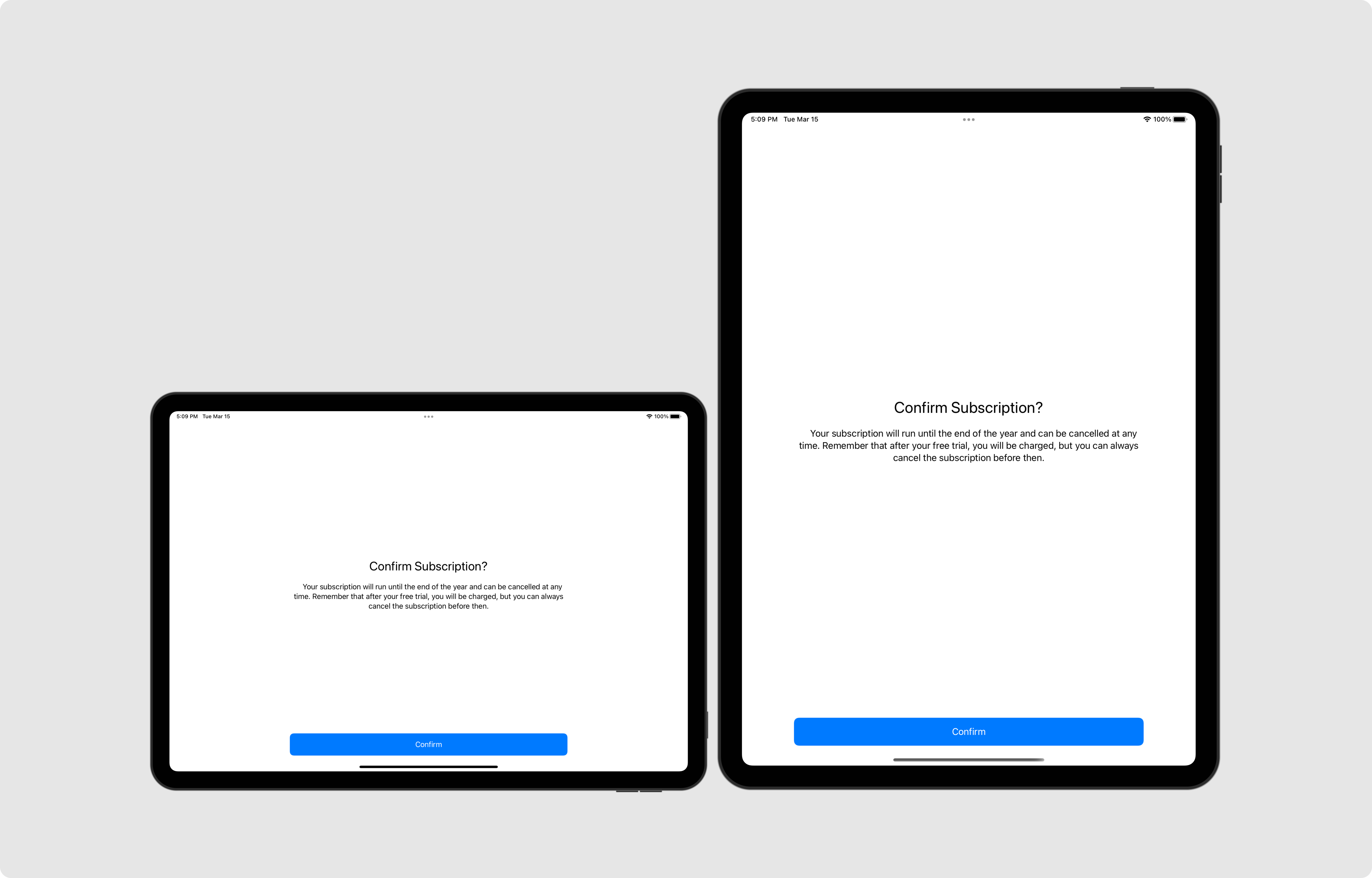
But what happens when we look at the iPad? Does it look like we are making a good use of the screen’s real estate? Note that we have made the message text a bit longer to see the behaviour of longer text in bigger screens.
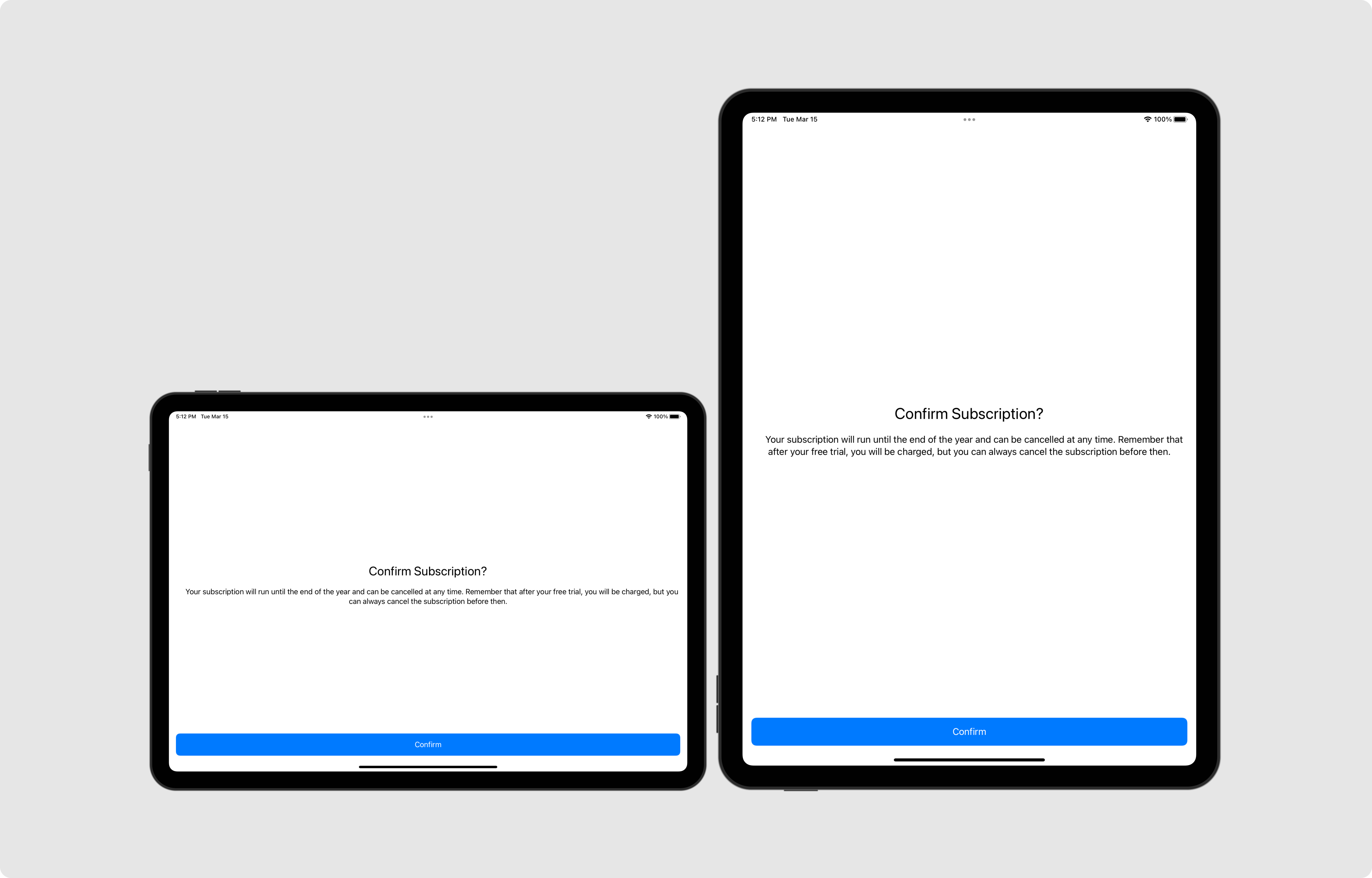
Well, let’s just say it doesn’t look great 😅
Readable Content Guide
The screenshot above shows that the text spans too wide on larger screen sizes, such as the iPad Pro’s. This is not ideal as it makes the text harder to read for users and might force them to move their heads from side to side to be able to read what’s on screen.
While we can fix this by adding a magic number constraint and make the container width not take up more than that number (say for example 500 points), that feels arbitrary and leaves us thinking that there has to be a better solution… and in fact there is!
We can use the readableContentGuide property on the view controller’s view, which gives us a set of anchors to constraint our content to that will ensure that, based on the user’s content size category preference, our content will always be read with ease, by just making a couple of constraint changes:
NSLayoutConstraint.activate([
    containerView.leadingAnchor.constraint(equalTo: view.readableContentGuide.leadingAnchor),
    containerView.trailingAnchor.constraint(equalTo: view.readableContentGuide.trailingAnchor),
    containerView.bottomAnchor.constraint(equalTo: view.readableContentGuide.bottomAnchor),
    containerView.topAnchor.constraint(equalTo: view.readableContentGuide.topAnchor),
])
As you can see in the image below, the content is nicely centered and always keeps a width suitable for reading:
Why do we need a part 2?
While the decision to pin the buttons to the bottom is helpful for accessibility reasons, i.e. it keeps the action visible no matter how big the message is, it does mean that part of the copy might not be visible on some devices for large text content sizes.
There are further improvements we can make too exploiting the power of constraint’s priorities, such as allowing the UIButton to not take up the whole width of the container and just a fraction of it instead.
In the next part, we’ll look at how UIScrollViews can be our best friend to keep our layouts accessible and extend our views only when needed. We’ll also look into all of its layout guides and ways to react to content changes.