Creating an App Store Connect-like picker for macOS with SwiftUI

Go from confusion to confidence with a step-by-step Swift Concurrency course, helping you smoothly migrate to Swift 6 and fully leverage its features.
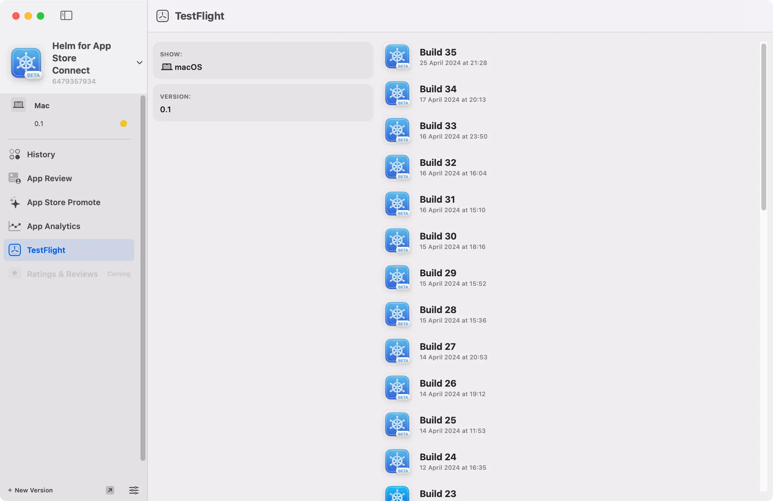
I have recently been working on a brand new screen for Hidde and my app Helm that allows you to see all builds available on TestFlight and lets you add them to beta testing groups.
As part of this work, I needed to create a component that allows users to add and remove beta groups from a specific build. I wanted to build something similar to the picker component in App Store Connect to make the experience as familiar as possible for users and, in this article, I will show you exactly how I built it using SwiftUI for macOS.
Creating the picker component
Let’s consider we have a set of builds that we want to display in a SwiftUI list. Each of these builds contains a set of properties amongst which is betaGroups which is an array of structs representing the beta groups that the build is part of.
struct VersionBuild: Identifiable, Equatable {
    let number: String
    let date: Date
    let hasAppClip: Bool
    let iconURL: URL?
    let id: String
    let isProcessing: Bool
    var betaGroups: [BetaGroup]
}

struct BetaGroup: Identifiable, Equatable {
    let id: String
    let name: String
}
The list displays build information using a simple component called TestFlightBuildCell:
struct TestFlightBuildCell: View {
    let build: VersionBuild

    var body: some View {

        HStack(spacing: 12) {
            if let appIcon = build.iconURL {
                KFImage(appIcon)
                    .retry(maxCount: 3, interval: .seconds(5))
                    .cacheOriginalImage()
                    .resizable()
                    .appIconImage(size: .small)

            }

            VStack(alignment: .leading) {

                HStack(alignment: .center) {

                    VStack(alignment:.leading){

                        Text("Build \(build.number)")
                            .font(.HELheadline)
                            .foregroundStyle(.primary)
                            .place(.leading)


                        Text(build.date.fullText)
                            .font(.HELfootnote)
                            .foregroundStyle(.secondary)

                        if build.hasAppClip {
                            Label("Includes App Clip", systemImage: "appclip")
                                .font(.HELfootnote)
                                .foregroundStyle(.secondary)
                        }
                    }

                    Spacer()

                    if build.isProcessing {
                        BuildTag(
                            title: "PROCESSING",
                            background: build.isProcessing ? Color.warning.opacity(0.3) : Color.gray.opacity(0.1)
                        )
                    }
                }
            }
        }
    }
}
In the context of the app, the list looks as follows:

While the component above does a good job of conveying the necessary build information, it still lacks some key functionality for this part of the app. We need to be able to decide which beta groups a build belongs to and add or remove them as needed:
Let’s see what the code for the beta group picker component looks like in SwiftUI:
struct BetaGroupPicker: View {
    // 1
    @Binding var betaGroups: [BetaGroup]
    // 2
    let availableBetaGroups: [BetaGroup]
    // 3
    @State var hoveringGroup: BetaGroup?

    var body: some View {
        HStack(spacing: 4) {
            // 4
            ForEach(betaGroups) { betaGroup in
                Text(betaGroup.displayName)
                    .padding(4)
                    .background(Color.gray.opacity(0.2))
                    .bold()
                    .clipShape(Circle())
                    // 5
                    .onHover { hovering in
                        withAnimation {
                            hoveringGroup = hovering ? betaGroup : nil
                        }
                    }
                    // 6
                    .overlay(alignment: .topTrailing) {
                        if hoveringGroup == betaGroup {
                            Button {
                                withAnimation {
                                    betaGroups.removeAll(where: { $0 == betaGroup })
                                }
                            } label: {
                                Image(systemName: "minus.circle.fill")
                                    .foregroundStyle(Color.red)
                            }
                            .buttonStyle(.plain)
                            .offset(x: 2, y: -4)
                        }
                    }
            }

            // 7
            if !availableBetaGroups.isEmpty {
                Menu {
                    ForEach(availableBetaGroups) { betaGroup in
                        Button {
                            withAnimation(.snappy) {
                                betaGroups.append(betaGroup)
                            }
                        } label: {
                            Text(betaGroup.name)
                        }
                    }
                } label: {
                    Text(Image(systemName: "plus"))
                        .padding(4)
                        .background(Color.blue.opacity(0.2))
                        .bold()
                        .clipShape(Circle())
                }
                .menuStyle(.button)
                .buttonStyle(.plain)
            }
        }
    }
}
A lot is going on in the snippet above, so let’s break the code down:
- A binding to the array of beta groups available in the build. It is passed as a binding because we want to be able to modify it from the inner view.
- An array of all available beta groups that can be added to the build. The parent view is in charge of providing this information, as we will see in the following section.
- A state property to keep track of the beta group that the user is hovering over. The value of this property is used to display a remove button in the beta group that the user is hovering over.
- Iterate over the beta groups that the build is part of and display them as circular text views using the
displayNameproperty on theBetaGroupstruct. - Modify the
hoveringGroupstate property when the user hovers over a specific beta group component. - Display a remove button when the user hovers over a beta group component using the
.overlaymodifier. The button removes the beta group from the list of beta groups that the build is part of. - If any available beta groups can be added to the build, display a plus button that lets the user choose which beta group to add.
The snippet above uses a property on the BetaGroup struct called displayName to display the name of the beta group in a similar way to how it is displayed in App Store Connect, showing the first letter of the first two words in the name in uppercase:
extension BetaGroup {
    var displayName: String {
        let output = name
            .components(separatedBy: .whitespaces)
            .filter { $0.lowercased() != "and" && $0.lowercased() != "&" }
            .prefix(2)
            .map { $0.first?.uppercased() ?? "" }
            .joined()

        return output.isEmpty ? "TF" : output
    }
}
Using the picker component
Now that we have the BetaGroupPicker view, we can start using it in the TestFlightBuildCell component to allow users to add and remove beta groups from a specific build:
struct TestFlightBuildCell: View {
    @Binding var build: VersionBuild
    let availableBetaGroups: [BetaGroup]

    init(
        build: Binding<VersionBuild>,
        availableBetaGroups: [BetaGroup]
    ) {
        self._build = build
        self.availableBetaGroups = availableBetaGroups.filter { !build.wrappedValue.betaGroups.contains($0) }
    }

    var body: some View {

        HStack(spacing: 12) {
            if let appIcon = build.iconURL {
                KFImage(appIcon)
                    .retry(maxCount: 3, interval: .seconds(5))
                    .cacheOriginalImage()
                    .resizable()
                    .appIconImage(size: .small)

            }

            VStack(alignment: .leading) {

                HStack(alignment: .center) {

                    VStack(alignment:.leading){

                        Text("Build \(build.number)")
                            .font(.HELheadline)
                            .foregroundStyle(.primary)
                            .place(.leading)


                        Text(build.date.fullText)
                            .font(.HELfootnote)
                            .foregroundStyle(.secondary)

                        if build.hasAppClip {
                            Label("Includes App Clip", systemImage: "appclip")
                                .font(.HELfootnote)
                                .foregroundStyle(.secondary)
                        }
                    }

                    Spacer()

                    if build.isProcessing {
                        BuildTag(
                            title: "PROCESSING",
                            background: build.isProcessing ? Color.warning.opacity(0.3) : Color.gray.opacity(0.1)
                        )
                    }
                }
            }

            BetaGroupPicker(
                betaGroups: $build.betaGroups,
                availableBetaGroups: availableBetaGroups
            )
        }
    }
}
As you can see, using the component is straightforward. You just need to modify the build property on the parent view to be a binding and pass the available beta groups to the component.
As you can see, we are writing a custom initializer to filter out any beta groups that are already part of the build.